International department of the Humboldt University of Berlin
2022 – 2024
CDLX / Martin Christel / Hugo Göldner / Isa Soysal
Humboldt-International
Task
Redesigning the web of Humboldt university. One of the major universities of Germany that has served under five different governments and is home to about 40.000 students. That is a massive act and includes hundreds of departments and people and thousands of websites.
So we started small. Developing a system and using it for pieces of the puzzle. Hu-international the international office of the university was a great start.
Science and education. Different cultures, languages and approaches. The international Exchange condenses university work.
Goals
Classy / modern / elegant / versatile / scientific
Applying our design system to hu-international. This was a special pleasure as Alexander von Humboldt actually was great. And the vibe of expedition – being smart and pragmatic while juggling around with financial boundaries and different groups and demands – that was part of the project.
Bringing our design that was developed for the Humboldt-University in general to another entity brought some tasks:
Convincing the university people by our design ideas that are sometimes quite far away from the university standard
Adapting our system to the needs of the university work. We are the designers but the website has to be used by the hu. And they are the pros in their field.
Students from the hu as well as from all over the world seek very broad to very specific information.
Do
We rebuilt the whole site. Going through workshops on information architecture, content and flows for tools with the international team. Keeping our hu-system organic we introduced changes that are benefits for the rest too.
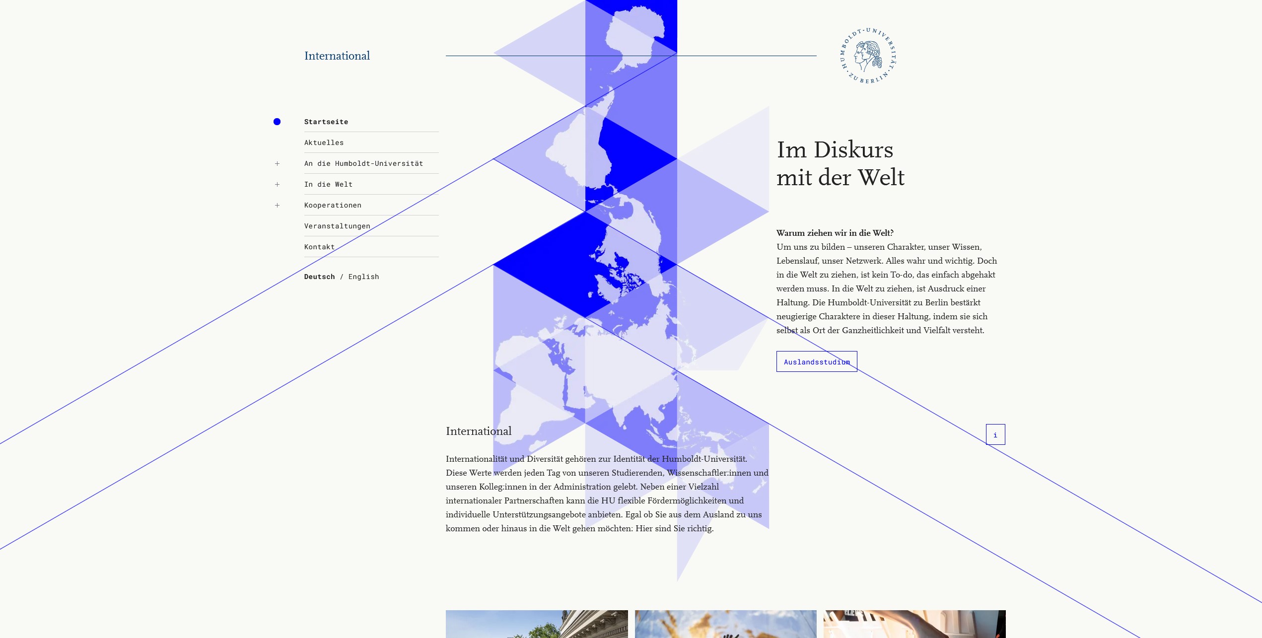
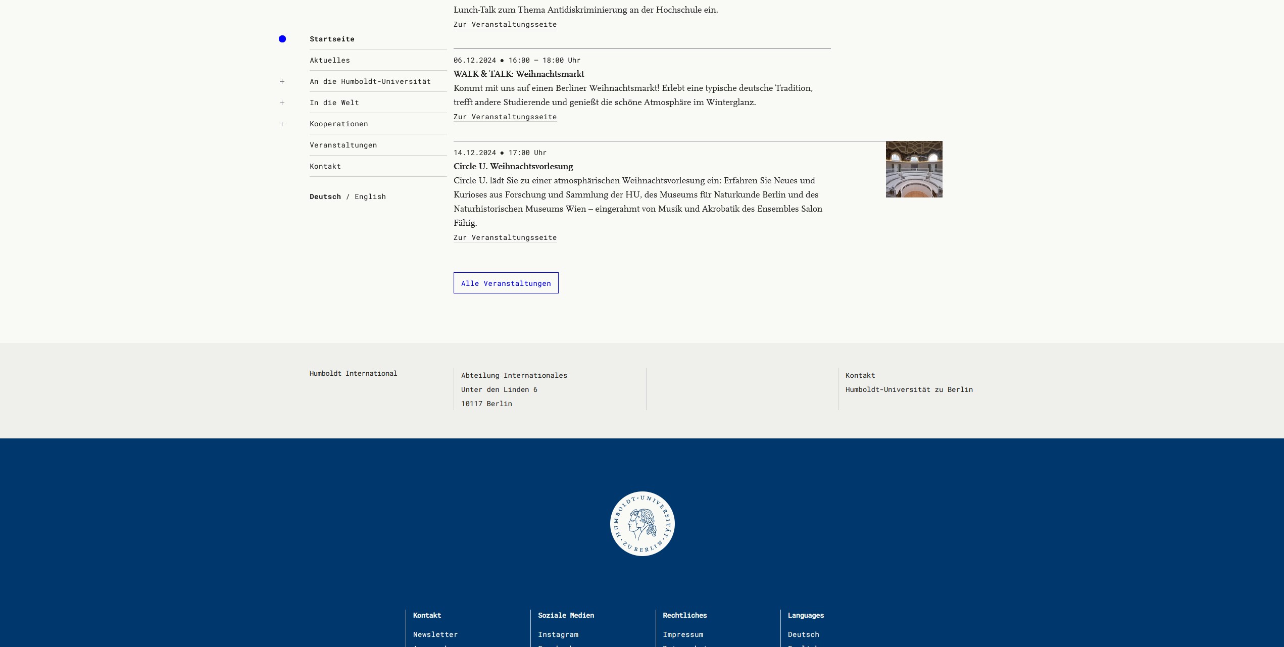
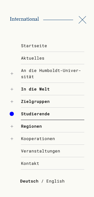
Navigation
A thing with universities is that some entities have many pages while others have very few. At the same time we have to be ready to integrate the meta university menu.
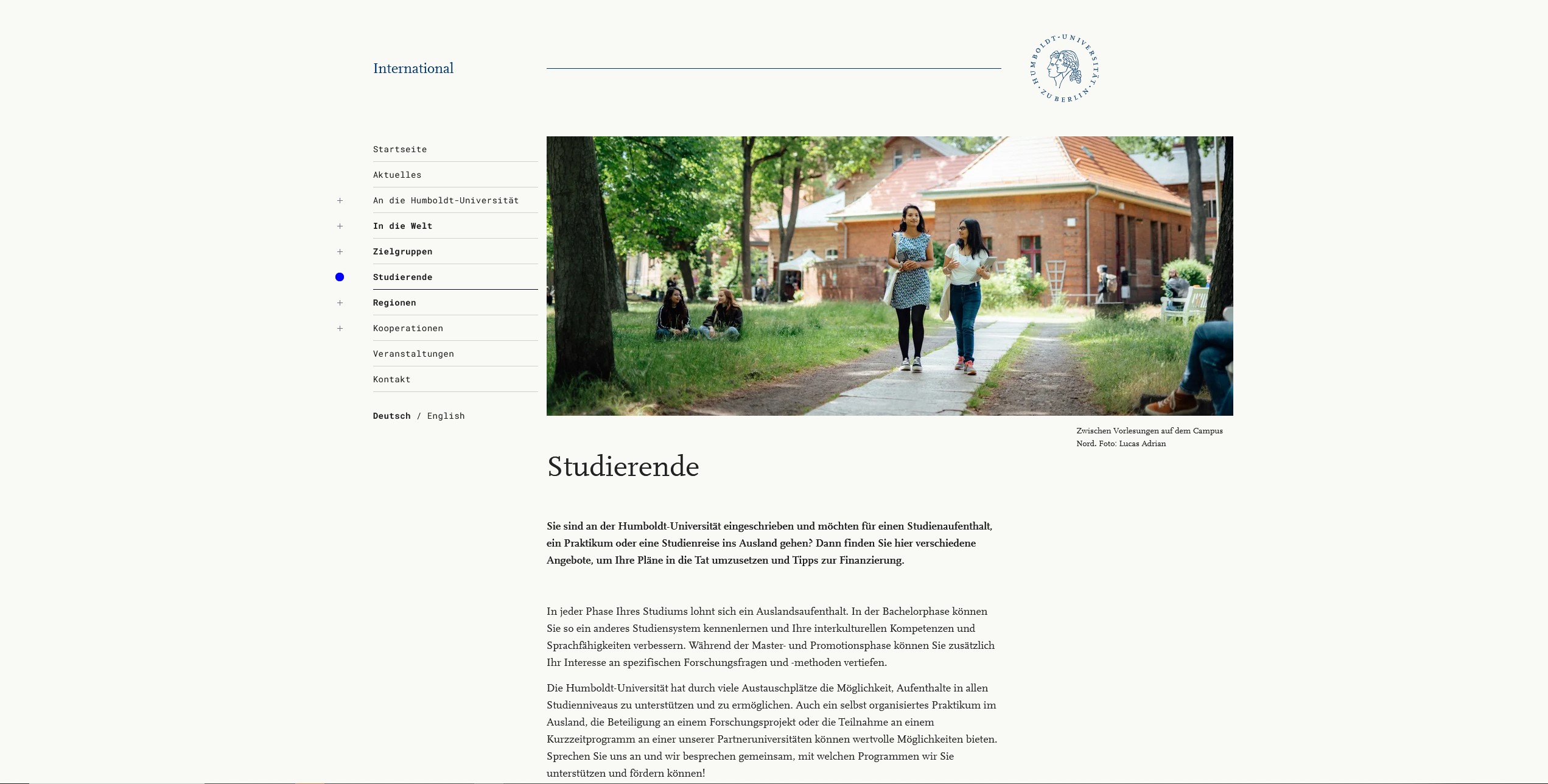
We came up with a menu that combines a classic drill down menu with breadcrumbs and the ability to unfold parts of the structure for power users. It works on desktop and mobile. It’s base use is intuitive. It’s advanced use let’s you navigate through the menu without navigating through the page. And it tells you where you are on the page.
It took a lot of workshops with developers and clients and a lot of Figma prototype work. The result is worth it.
So what do I think?
Universities are special clients. Divers and interesting people. An enormous size and special requirements in terms of technicality. The workflow differs from the private sector as decisions are made differently and eg the change of the university president can freeze a project for months.
I met highly motivated people and worked on abstract communication as well as on hands on information. We changed the style of the website from an old bureaucratic labyrinth to a stylish but elegant library.